In today’s fast-paced digital world, parents expect instant, clear, and reliable communication from schools. From attendance alerts to exam schedules and emergency notices, mobile apps have become the primary bridge between schools and families. But simply having an app isn’t enough. The real challenge lies in designing an intuitive parent app that parents of all ages can use effortlessly.
An intuitive parent app reduces confusion, builds trust, and strengthens parent-school relationships. At platforms like amrithaa.com, the focus is on creating digital experiences that feel simple, human, and reliable especially when it comes to education technology.
Let’s explore how intuitive design can transform parent apps into powerful communication tools.
Parents are not all tech-savvy. Some may be comfortable with smartphones, while others may struggle with complex menus or unclear icons. An intuitive design ensures that any parent can access information quickly without training or frustration.
When apps are confusing, parents miss updates, notifications go ignored, and trust erodes. On the other hand, a well-designed app improves engagement, reduces calls to school offices, and enhances overall satisfaction.
Intuitive design isn’t about adding more features it’s about making the right features easy to use.
Navigation is the backbone of any parent app. Parents should immediately understand where to find key information like announcements, attendance, homework, and fees.
Using clear labels instead of technical terms makes a big difference. For example, “Today’s Updates” works better than “Dashboard.” Grouping related features together and limiting menu depth ensures parents don’t get lost clicking through screens.
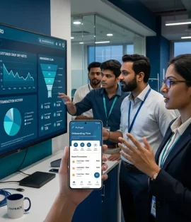
Apps designed by teams like amrithaa.com focus on logical layouts where important updates appear front and center, reducing the time parents spend searching for information.
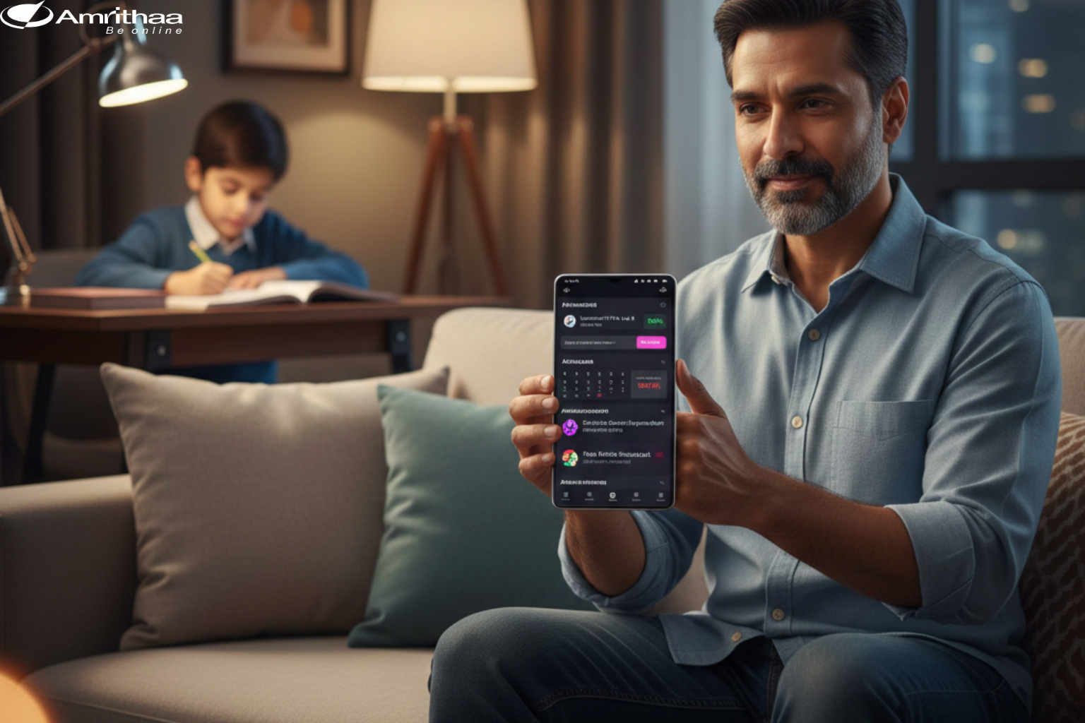
Notifications are essential but only when used wisely. Parents appreciate timely alerts about absences, exam schedules, circulars, or emergencies. However, too many notifications can feel overwhelming and lead users to mute the app entirely.
An intuitive parent app allows customizable notification preferences, letting parents choose what matters most. Clear notification messages, simple language, and consistent timing build trust and reliability.
Good notification design respects parents’ time while keeping them informed.
Visual simplicity is key. Clean layouts, readable fonts, high contrast, and intuitive icons make the app accessible for all parents, including those with limited digital experience.
Avoid cluttered screens. Use whitespace to guide attention. Icons should be familiar and supported by text labels to avoid confusion.
A thoughtful visual approach ensures parents feel confident using the app without needing tutorials or support.
Parent apps handle sensitive information like student records, attendance data, and communication history. Intuitive design must also communicate security clearly.
Features like secure logins, OTP verification, and clear privacy settings reassure parents that their data is safe. Transparent design builds confidence and strengthens long-term adoption.
At amrithaa.com, secure UX design is treated as a core feature not an afterthought ensuring trust is built into every interaction.
Designing intuitive parent apps for school updates isn’t about flashy features or complex animations. It’s about clarity, empathy, and ease of use. When parents can instantly understand what’s happening at school, communication becomes smoother and relationships grow stronger.
Schools that invest in intuitive digital experiences reduce administrative workload and increase parent engagement. With thoughtful design and a parent-first mindset, apps can truly support modern education.
Looking to design or improve a parent communication app?
Explore smart, user-centric digital solutions with amrithaa.com and create experiences parents trust.